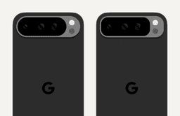
I can’t stop staring at the back of the Pixel 9 series. It looks like Google ignored conventional design wisdom on how to nest rounded shapes within one another.
The back of a 9 Pro for reference:
Take a close look at the relationship between the top corners of the device and the corners on the rounded pill the camera hardware sits in.
Here’s what that camera pill would look like if it were designed to nest more conventionally:
It’s subtle but the difference is clearer if the camera module is moved closer to the top edge.
The gap between the camera pill and the device edge isn’t consistent as you follow the curve from left to top and top to right; it gets larger as you approach a corner’s midpoint and then decreases as you approach the top or sides. The example on the right maintains an even gap between device edge and camera module regardless of where the distance is measured.
And here’s a side by side:
Why did Google do this?
Two guesses. One, this quirk is less obvious with the camera positioned where it is. Two, the pill shape is unique and more recognizably Pixel than a rounded rectangle would have been. I’d wager it’s both, with more weight given to the latter and the former serving as a way to mitigate that decision.
Whatever the reason, I haven’t been able to ignore this very tiny detail.


